
Editor's note: This post was originally published in 2013 and has been updated July 2017 for new best practices and freshness.
Software and technology companies use their websites as a central hub and conversion tool for marketing campaigns. In order to compete, your software website must provide access to more in-depth information and conversion touch points without overwhelming the visitor. Therefore, software companies have to be very strategic in their web design.
These six web design tips for software companies can help your business ensure the website performs as a strong lead-generation tool.
![Marketing Opportunities for B2B Technology Companies [Free eBook PDF]](https://no-cache.hubspot.com/cta/default/281355/6d0eface-5ae2-47a2-adaa-ec69351f5af5.png)
30% of people leave a website or stop engaging because the content is too long (Adobe).
 However, in-depth content is also important to having your site "crawled" and ranked by Google in searches. So how can you compromise for the search engine, and the reader?
Maybe content as relevant as possible to your buyer, and also use formats that are appealing. When publishing long copy, use graphics to explain points visually. You can also use card design, which breaks up concepts to different cards, each with an icon or image and text. These design elements will maintain the need for more copy and create a visually appealing site.
Any website that has too much text, images, or an awkward color balance will not entice visitors. Since software marketing can involve technical specifications, features, and price points to share, you can offset information overload with a website that utilizes white space appropriately.
A study found that good use of white space between paragraphs and in the left and right margins increases comprehension by almost 20%.
So while you’re explaining how a product can impact the buyer, remember to make it easy on the reader with white space.
47% of website visitors view a company’s products or services page before looking at any other sections of the site.
To really engage the visitor, consider showing product demos in video format either on the homepage or on the products page. You can include explanatory copy below for those who want more information, but a virtual tour or demo can help the viewer really understand the product.
If your company wants to collect contact information prior to providing access to a product trial, then ensure that a call-to-action for a photo tour or video demo is accessible and easy to find on the website, so the visitor does not have to search too much.
Once your website loads, users form an opinion in .05 seconds (Kinesis).
For software companies, you want users to see the benefits immediately when they land on your website. You also have to do this quickly, since users read just slightly more than a quarter (28%) of the content they see on a web page (NN Group).

One way software companies show consumer benefits is through scrolling boxes or with a bulleted list. However designed, each of the benefits should link to a page with more information, so you can test which benefit the responds to the most.
The CTA buttons on your website are important to converting users and pushing them through the sales funnel. HubSpot’s advice for CTAs include:
These four tips are important because users need to see the CTA, which means it needs to be big, contrast the color of the page, above-the-fold so they can click it, and include enticing copy. But what’s really important as well is to make sure the CTA is relevant. Each page should have a CTA relevant to the buyer's position in the sales process.
For example, you will not have a “Purchase” CTA on the homepage since users know nothing about your company or product. The CTA must add value to what page they are on, so customize CTAs based on the buyer journey.
 Source: growthdrivendesign.com
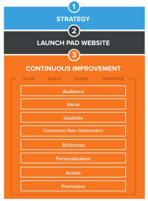
For a strong online marketing strategy, you should continually A/B test various elements of your website design, which means continual updates and changes.
Design and content can easily get stale, so software companies should start with top performing landing pages to analyze what makes them work well. Identify the top performing landing pages:
Then, using analytics and heat maps to discover which elements on your page get the most clicks, run A/B tests and try updating elements with low click-throughs and engagement. You can go further and discover where a potential customer signs off the website by analyzing bounce rate and motion through your website (Google Analytics is a great, free tool for this.)
48% of people cited a website’s design as the number one factor in deciding the credibility of a business, so this testing will be crucial to gaining the trust of potential buyers.
Software and technology companies must remember to take a customer-first approach during design. It’s not about the company — it’s about the consumer, which means pain points and benefits should be first and above-the-fold. Interested visitors will continue to read more about the company, but first, a clear value proposition will hook them.
94% of people cited web design as the reason they mistrusted or rejected a website.
So continual updates on design elements and copy will be important to maintaining high conversion rates.
https://wwwimages.adobe.com/content/dam/Adobe/en/max/2015/pdfs/state-of-content-oct.pdf
https://www.smashingmagazine.com/2009/09/10-useful-usability-findings-and-guidelines/
https://komarketing.com/files/b2b-web-usability-report-2015.pdf
https://www.kinesisinc.com/the-truth-about-web-design/
https://www.nngroup.com/articles/how-little-do-users-read/
https://blog.hubspot.com/blog/tabid/6307/bid/20788/4-Tips-to-Supercharge-Call-To-Action-Buttons.aspx?__hstc=225549637.4950187f265345c65dc5f37111dad0b5.1498855255213.1498855255213.1498855255213.1&__hssc=225549637.1.1498855255214&__hsfp=70242250
by Jonathan Franchell, CEO of Ironpaper - For more tips and hacks: Need to remove a new line after h1 tags? Both web designers and SEO practitioners need to employ headline tags: H1, H2, H3 in several ways to improve web page structure and tag...

The Crowded Arena of the IT Marketplace Updated December 2024 The Information Technology (IT) landscape is experiencing rapid growth and intensifying competition. IT spending is projected to reach nearly 5.1 trillion U.S. dollars in 2024, a...
The marketing industry is transforming significantly due to generative AI and increasing market complexity. Gartner's prediction of a 25% decline in traditional search traffic suggests that the era of search engines is dying. AI tools, particularly...
Updated December, 2024 The field of digital marketing is evolving rapidly in response to new technology and changing buyer expectations. To help career-minded marketers, we’ve rounded up the top 10 skills needed to succeed in the field. These are...

