
As the digital world continues to “go mobile”, today’s brands need to evolved their digital presences and take an analytical look at how to properly present themselves online. Considerations include where in the mobile world their constituents are and how to create the best returns. Key in that decision is the role of their website’s mobile responsiveness and when the best strategy includes a native mobile application. And while the truth of the matter is most brands may ultimately need both, where to start, what sort of technical commitment should they make and what are the priorities need to be considered.
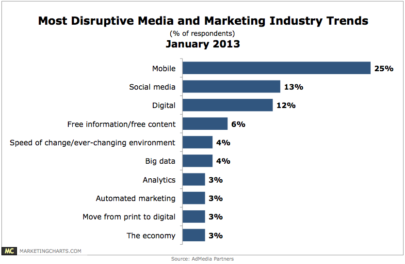
An AdMedia Partners survey of media and marketing executives found that a plurality 25% see mobile as the most disruptive force in their industry. Mobile outpaced social media (13%), digital (12%), and free information/free content (6%). According to the study, apps from retail businesses took up to 27% of consumer’s time. Likewise, 67% of consumers say they are more likely to purchase from a mobile-friendly website than they are from a website not optimized for their smartphone or tablet.
Looking at the data collectively, it has it become apparent that a brand, especially a consumer brand, should have both a responsive site and a native mobile app in order to capture the attention of their entire mobile audience. The native mobile app will provide the most dynamic mobile experience for existing customers, while a responsive website will provide an optimized experience to visitors browsing a brand’s website or discovering the brand for the first time. Executing both requires a fundamental mobile strategy, especially as technologies and data will most likely be shared, which is why it’s important to understand the advantages of both.
Responsive web design is certainly the more affordable option compared to the development of a mobile app. Most likely it’s an exercise in taking an existing website and evolving it for the mobile platform. Responsive websites address visibility in search engines and is critical in helping grow traffic to a brand’s touch-points. A mobile app, on the other hand, is found in a closed environment (most likely app stores) and cannot be indexed by the search engines. This then, requires driving traffic to the mobile app through alternate methods such as landing pages, PPC, viral buzz and existing customer advertising.
A responsive Web design often takes far less time to create then does a mobile app since the coding language itself can be easer to implement, there’s no app store approval, or extensive guidelines to have an application available on the iOS app store, Google Play, or the Windows Phone app store. A responsive designed website is universally accessible from any device. A mobile app is designed for a unique experience exclusive to the operating system it lives on, which means it needs to re-developed, maintained, and even designed specifically for each particular mobile platform. And while a responsive website is optimized universally, it doesn’t incorporate all the smart phone features like the camera or GPS that a native mobile app can. A mobile app will take advantage of the unique functionality and speed of the platform it is developed for that can’t be achieved through a mobile web browser.
A mobile app has the opportunity to offer a compelling, mobile-centric experience, so it’s essential to match the features of the operating system with the type of app you’re looking to create. Besides being able to utilize more of the features incorporated in a mobile operating system, a mobile app often has access to more data from a user and therefore, can provide a more personalized experience such as push notifications, product recommendations, suggested content, or other user-driven actions. When a user creates a profile in their mobile app, it makes gathering data about that person easier for the brand and a much more seamless experience for the user. In-app purchasing drives 76% of all app marketplace revenues and it’s particularly easy for users to make a purchase with pre-entered credit card information. Mobile websites today cannot offer the same fluidity.
A native mobile app offers the best user experience for a person on a mobile device since there are still limitations to how HTML 5 can be parsed on mobile. As the complexity of the responsive website increases, the more likely the user experience will suffer as it relies on the devices browser first and the core functionalities of the particular mobile platform second, if at all.
by Jonathan Franchell, CEO of Ironpaper - For more tips and hacks: Need to remove a new line after h1 tags? Both web designers and SEO practitioners need to employ headline tags: H1, H2, H3 in several ways to improve web page structure and tag...

The Crowded Arena of the IT Marketplace Updated December 2024 The Information Technology (IT) landscape is experiencing rapid growth and intensifying competition. IT spending is projected to reach nearly 5.1 trillion U.S. dollars in 2024, a...
The marketing industry is transforming significantly due to generative AI and increasing market complexity. Gartner's prediction of a 25% decline in traditional search traffic suggests that the era of search engines is dying. AI tools, particularly...
Updated December, 2024 The field of digital marketing is evolving rapidly in response to new technology and changing buyer expectations. To help career-minded marketers, we’ve rounded up the top 10 skills needed to succeed in the field. These are...

