


Making an impact online doesn’t need to come from flashy, yearly redesigns. You don’t even need the latest web trends or a fresh branding package. Simple optimizations can make your B2B website more impactful. We call these quick wins “low hanging fruit.” Think of small changes for a big return.
When optimizing, make changes quickly and swiftly. Use the template as it already stands. That is, try not to completely overhaul a template or send to development. If there is a component you can edit with a rich text editor, do that first. Focus on messaging and driving value rather than overhauling design or page structure, which will take time to run through development. This is why you should build with a WYSIWYG editor – so marketers to go in and edit things quickly.
Read more: 6 Amazing Benefits of Agile Web Design
Here, five ways to optimize for more engagement, lead generation, and conversions.
Sometimes B2B businesses get caught up in being flashy or appearing high-tech. They inflate their website with high-definition videos, fancy animations, bloated interactivity, and moving text boxes. But all of these things risk legibility. And legibility is a essential function of a website.
Read more: Simple Web Design + Content Upgrades for Instant Engagement
Web users are inherently a little bit lazy. They feel rushed, so they scan content online. So the more obstacles you put in their way — and the more flashy things developers create — the harder it is for them to simply read the text and get the message.
Cut down on any legibility issues you have, like:
What you lose in “style points” you’ll make up for with immediate, compelling information. And very few businesses (besides maybe design agencies) win deals solely based on the look and feel of their website.
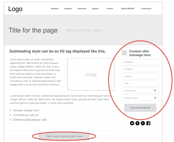
“Above the fold” is a term borrowed from print newspapers. It’s everything that’s visible before you have to unfold the page or scroll in the case of a web browser. Above the fold on your B2B website is your first impression space. It’s where engagement happens and decisions are made to click or to bounce.
A recent Google study showed that ads appearing above the fold had a 73% visibility, whereas those below it had just 44%. –AB Tasty
Everything above the fold is like your prime real estate. It’s where you identify your buyer and immediately demonstrate value. In this space, address your buyer directly (so for instance, say “IT Managers” instead of pronouns like “you”). Right away in the first few seconds, web users want to know: What will you do for me?
Avoid flashy filler language and speak directly to outcome value. Simplifying something like a partnership, or an innovative solution, isn't clear. Whether your target user is a business owner, a CFO, or an IT director, they are wondering, What will you do for me? What is the business outcome for me? What is our working relationship?
Read more: The Importance of Defining a Value Proposition for the IoT
Calls-to-action drive next steps on your site. You need a single CTA at least, but not too many to confuse the point. Include the most critical CTA for the buyer at hand. For example, “log in” won’t generate new leads, but “request demo” is clearer.
Be clear on who you are addressing in your CTA language. “Submit” or “learn more” are weak approaches. what is the outcome value and value prop, and what is the next step I should be taking. Simply adding a CTA is better than not having one at all.
You can promote your lead conversion further by promoting a mini form — asking a few questions to increase leads. Or revamping a section full of features/links to frame up something more clear and relevant, like problems and aspirations. This way of thinking resonates with buyers. It’s buyer-centric, like an actionable playbook, rather than autobiographical.
B2B messaging is both easy to update online and highly compelling when you do it right. Good messaging mentions pain points, value points, differentiators, and market forces that affect the buying decision. Need inspiration? Meet with your sales team, interview them, and document key takeaway points from actual prospects. Note the forces of innovation or disruption at play that would cause a buyer to speed up their decision process because they fear a threat.
Read more: Benefits of Integrating Sales and Marketing
AB Tasty, “Above the Fold vs. Below the Fold: Does it Still Matter in 2019” 2019
by Jonathan Franchell, CEO of Ironpaper - For more tips and hacks: Need to remove a new line after h1 tags? Both web designers and SEO practitioners need to employ headline tags: H1, H2, H3 in several ways to improve web page structure and tag...

by Jonathan Franchell, CEO of Ironpaper - For more tips and hacks: For iOS app developers, there are some annoying parts of the development process that many developers just hate. For one, only one person can be nominated to be Team Agent on Apple's...
The Crowded Arena of the IT Marketplace Updated December 2024 The Information Technology (IT) landscape is experiencing rapid growth and intensifying competition. IT spending is projected to reach nearly 5.1 trillion U.S. dollars in 2024, a...
Marketing healthcare technology presents unique challenges that differ significantly from other industries. The complexity of medical products, the stringent regulatory environment, and the diverse needs of healthcare providers create barriers that...