


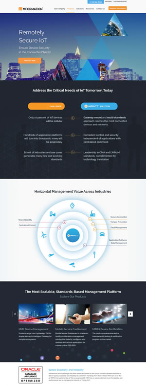
As the IT landscape becomes more competitive, significant, and full of opportunities than ever, it’s increasingly important to ensure that your enterprise's website is fresh, attractive, user-friendly, and engaging. As such, this article outlines the latest web design trends for IT companies – both good and bad – so you can make sure your site is using the design elements that are most appealing to today’s audiences.
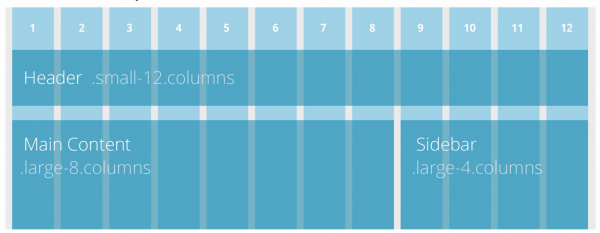
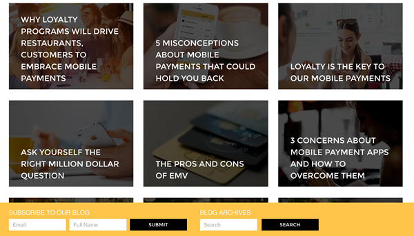
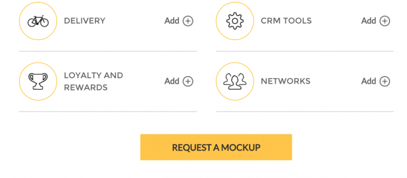
1. Grid layouts. Inspired by Pinterest, grid layouts are an ideal option for IT websites, because they offer a visually appealing way to organize complex and varied information. They involve using cards with easy-to-digest chunks of data, information, and content, making them simple to browse, shareable, and extremely popular among users today. In addition, they can contract, expand, and restructure themselves to fit any screen size, so they’re a terrific option for responsive websites as well.
2. A focus on high-quality content that educates, inspires, and builds trust. Your content is ultimately what’s going to engage your visitors and keep them on your site, so your design should revolve around it. We recommend creating a large amount of educational, relevant, and helpful content that speaks to your audience and solves their problems. From there, position your content front and center on your website, so visitors can easily find and engage with it.
3. Accessible, visually appealing images, typography, and site structure. Large images and fonts are very popular right now, because they’re associated with improved accessibility and they’re appealing to visitors. For starters, a full-screen background image or video is a simple and elegant way to tell your brand’s story. Although it's a trendy approach--the approach points to a desire to offer clarity and ease-of-use--without distraction. Regarding fonts, we’ve seen a dramatic increase in custom typefaces, artistic fonts, dramatic texts, creative uses for simple typefaces, and purposeful lettering – all of which add a fresh visual appeal to your website’s design.
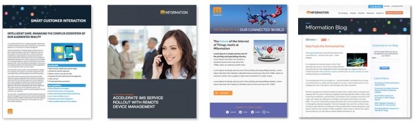
4. Expanded resource areas. As mentioned earlier, your content needs to be a critical part of your web design, because it’s what your visitors are going to interact with the most. We recommend taking your resources, blogs, FAQ’s, pricing sheets, and articles, and aggregating them using visual list pages or card layouts. Both of these options are easy for viewers to scan and will ensure that they’re able to find the information they need and stay engaged with your content as long as possible.
5. Long scroll to provide a compelling user journey and brand presentation. Long scrolling sites involve having all of the information about your company, services, and content on one page. You can either have one long home page that leads to additional smaller pages, or the entire site can exist on a single long page. Either way, the long scroll is extremely useful for storytelling, and it’s an elegant way to present your brand to the world. Plus, the simple navigation promotes interaction and engages your users longer.
6. More descriptive calls-to-action (CTAs). It’s time to say goodbye forever to generic CTAs like “learn more,” “download now,” and “click here.” Especially for IT companies, it’s important to use more descriptive CTAs that speak to your audience’s emotions and offer context into exactly why users should want to click.
Bad trend #1: Relying only on your home page to generate leads. Your homepage is no longer the most important page on your website. Today, users will find your company’s site in a number of different ways, through links they find via search engines, email, social media, advertising, and other channels. These entrance pathways will most likely direct them to landing pages and blog articles – not your home page. As such, all of your pages need to be thoughtfully designed and optimized to convert.
Bad trend #2. Using sliders on your homepage. We’ve said it before and we’ll say it again: sliders are out, because they don’t convert. So don’t use them! Instead of homepage sliders, we recommend adopting The Hero Layout, which involves using a single content section with one clear and easy to understand goal that comprises the entire first fold of your website. It feels simple and elegant – and it’s one of the highest converting layouts available.
Bad trend #3. Robotic SEO copy. Many IT companies still think there is a magic, one-time process for optimizing a website to compete for top positions within Google. Simply stated, do not create SEO-focused content using robotic, highly-saturated, highly-repetitive copy. It doesn't help you with Google, and it doesn't help to convert high value leads. Write your website content for actual users, and create buyer personas to ensure that your content matches the needs and aspirations of your target audience.
Here are a few tips for SEO to follow: 5 SEO Best Practices for Enterprise Websites
Related topic: Most Common IT Company Marketing Mistakes
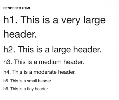
by Jonathan Franchell, CEO of Ironpaper - For more tips and hacks: Need to remove a new line after h1 tags? Both web designers and SEO practitioners need to employ headline tags: H1, H2, H3 in several ways to improve web page structure and tag...

The Crowded Arena of the IT Marketplace Updated December 2024 The Information Technology (IT) landscape is experiencing rapid growth and intensifying competition. IT spending is projected to reach nearly 5.1 trillion U.S. dollars in 2024, a...
by Jonathan Franchell, CEO of Ironpaper - For more tips and hacks: For iOS app developers, there are some annoying parts of the development process that many developers just hate. For one, only one person can be nominated to be Team Agent on Apple's...
Marketing healthcare technology presents unique challenges that differ significantly from other industries. The complexity of medical products, the stringent regulatory environment, and the diverse needs of healthcare providers create barriers that...